Film Review: OptiColour 200 Medium Format
Trying new film stocks is a great way to shape your visual style as a film photographer. In my Film Review series, I reflect on my experience shooting various film stocks and share sample images from the roll to help you decide if this film stock is worth a try.
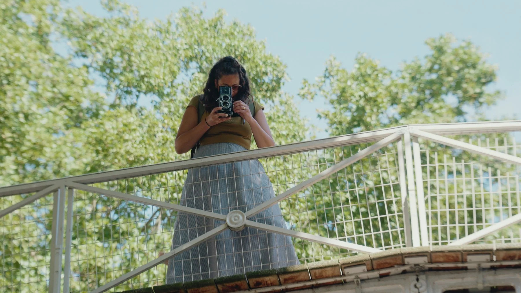
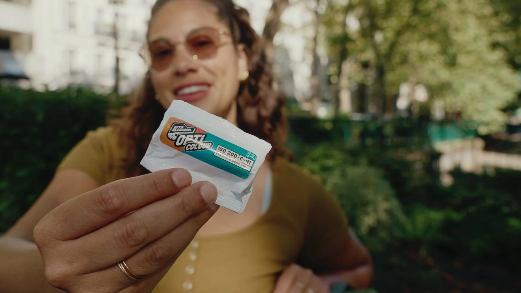
I ordered a few pre-production rolls of OptiColour 200 from Optik Oldschool and took one for a spin around Paris with my Rolleiflex. In this film stock review, I'll share my first impressions, discuss a few pre-production imperfections, and show sample photos.
If you're curious about alternatives to Kodak Gold or curious to experiment with different film emulsions, keep reading to find out whether Opticolour 200 is worth adding to your camera bag.
Another new 120 film stock has arrived. Welcome, OptiColour 200.
Produced in Germany by Optik Oldschool, OptiColour 200 is a daylight-balanced color negative film with good exposure latitude and a natural color palette. How exciting to see new film production on the rise because we want to keep analog photography alive. Have you tried the 35mm version of Opticolour 200?
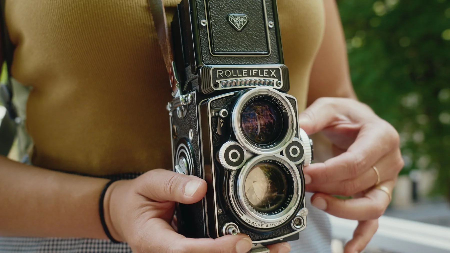
A new film stock in 2025 is pretty exciting, but that thrill is doubled since OptiColour is available in both 35mm and 120 format! There aren't many options when it comes to medium-format film, so needless to say, I was stoked to load this one into my Rolleiflex and take a spin. Watch the photowalk video on YouTube.
Now, the technical part: This film stock is based on the Orwo Wolfen NC200 emulsion, which, honestly, I'm not at all familiar with because it wasn't widely available in the past. Optik Oldschool modified the original emulsion by replacing its greenish base with an orange one, which is supposed to make it easier to scan with most modern scanners.
This is a good moment to mention that my lab scans shared here were made with Noritsu, which may have a subtle influence on the color palette. You might get different results by scanning film at home, which I plan to start doing in the near future. Do you have home scanning tips? I'd love to hear them! Let me know in the comments.
Now, it’s time to review the vibe of this film and my overall experience…
My First Impressions of OptiColour 200
I shot my first roll of OptiColour 200 at box speed in natural light around midday, and I'm happy to report it worked well in these conditions. Bright light helped make punchy colors. I noticed it has a moderate grain that adds organic texture without interfering with the details, but it's definitely more grainy than Kodak Gold, but that’s okay, it is a non-mainstream film stock after all. At first glance, everything lined up to function just like a 200-speed film should.
At the time when I shot my first roll of OptiColour 200, there weren't many film reviews available so, it was nice to experience something without too much input from others. I enjoyed shooting this new film stock and went at it with chill expectations, anticipating surprise results, which was all part of the fun! My main goal on this photowalk was to explore, have fun and keep an open mind about the final results… which I'm happy to say are pretty good!
Dreamy Colors
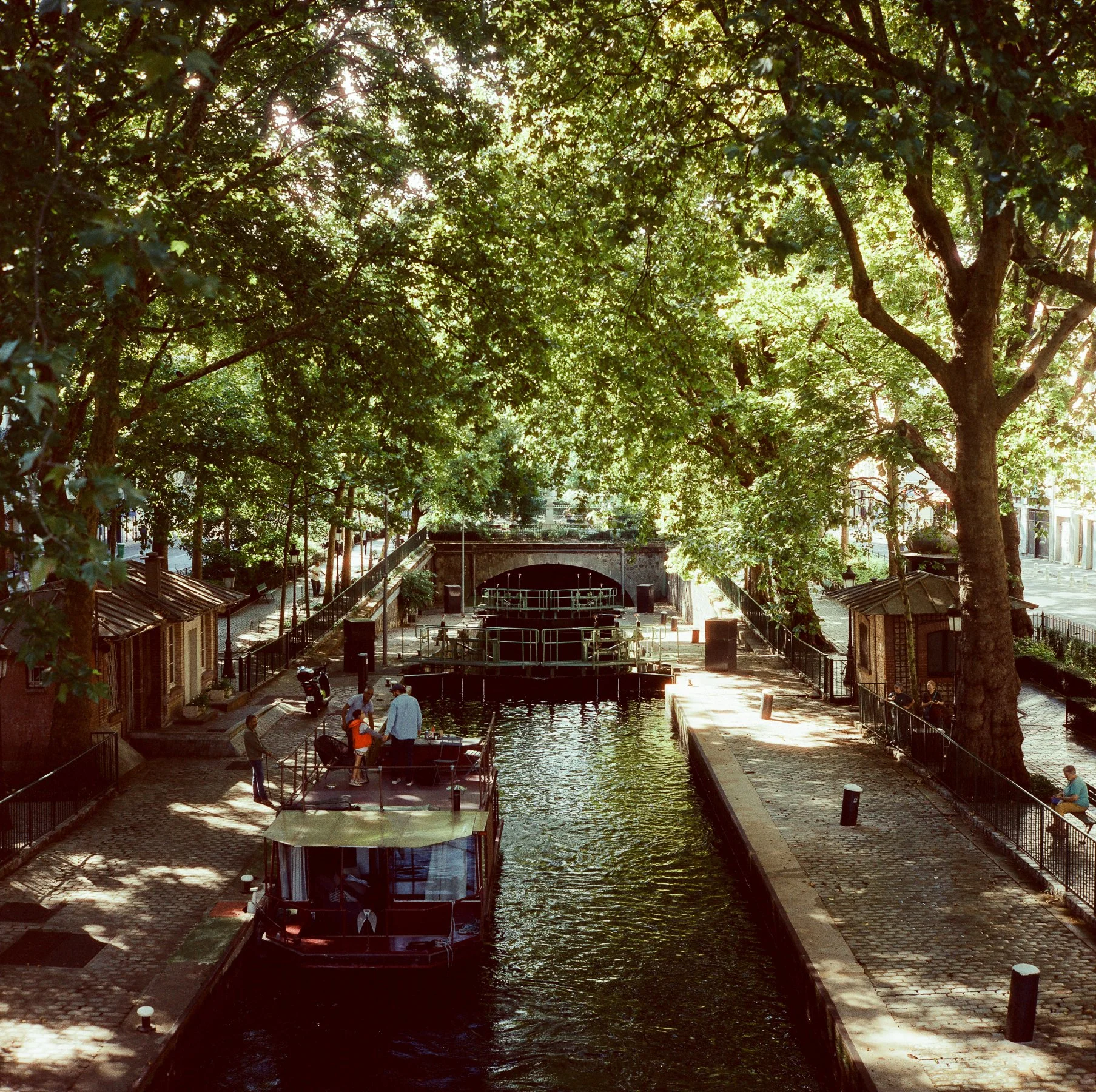
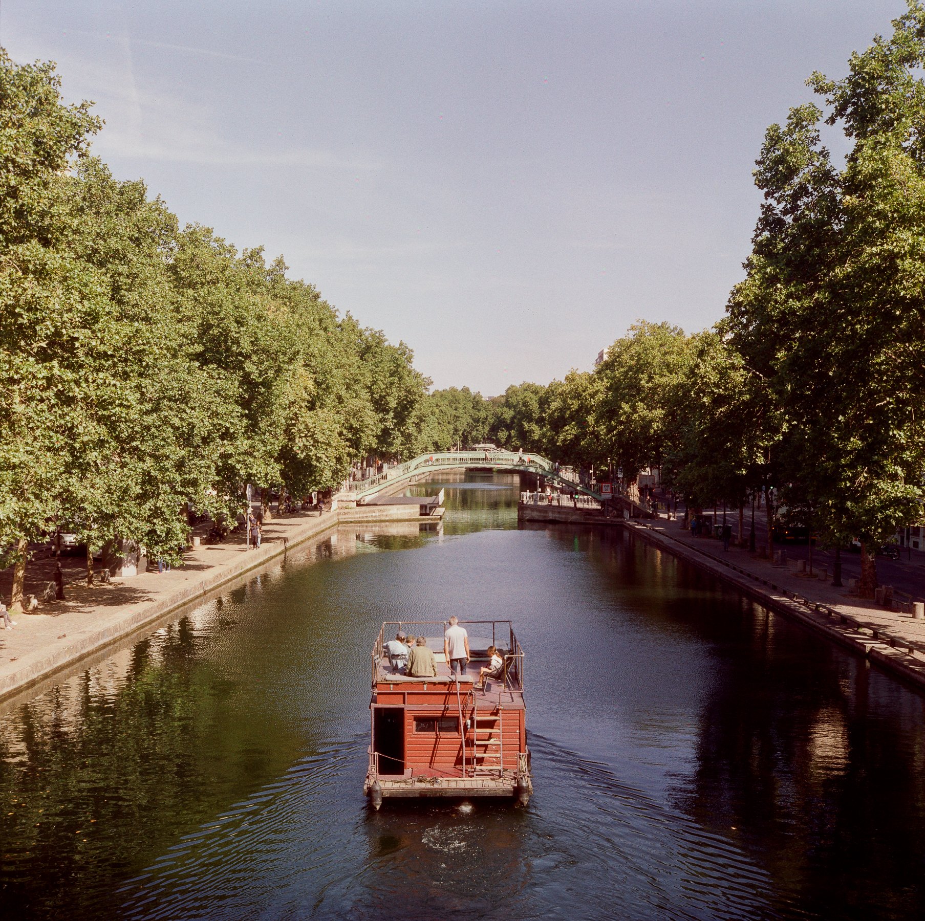
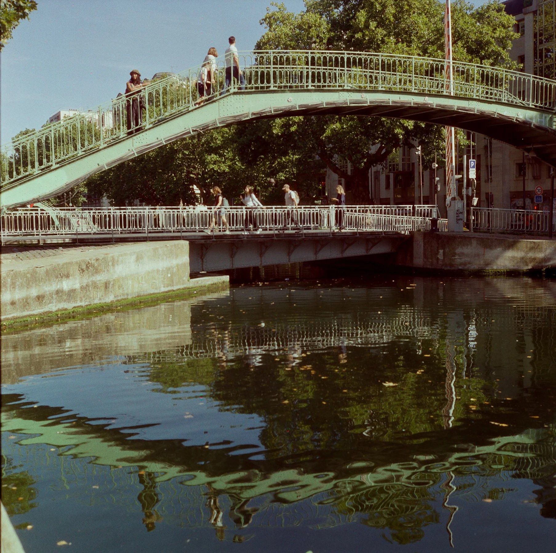
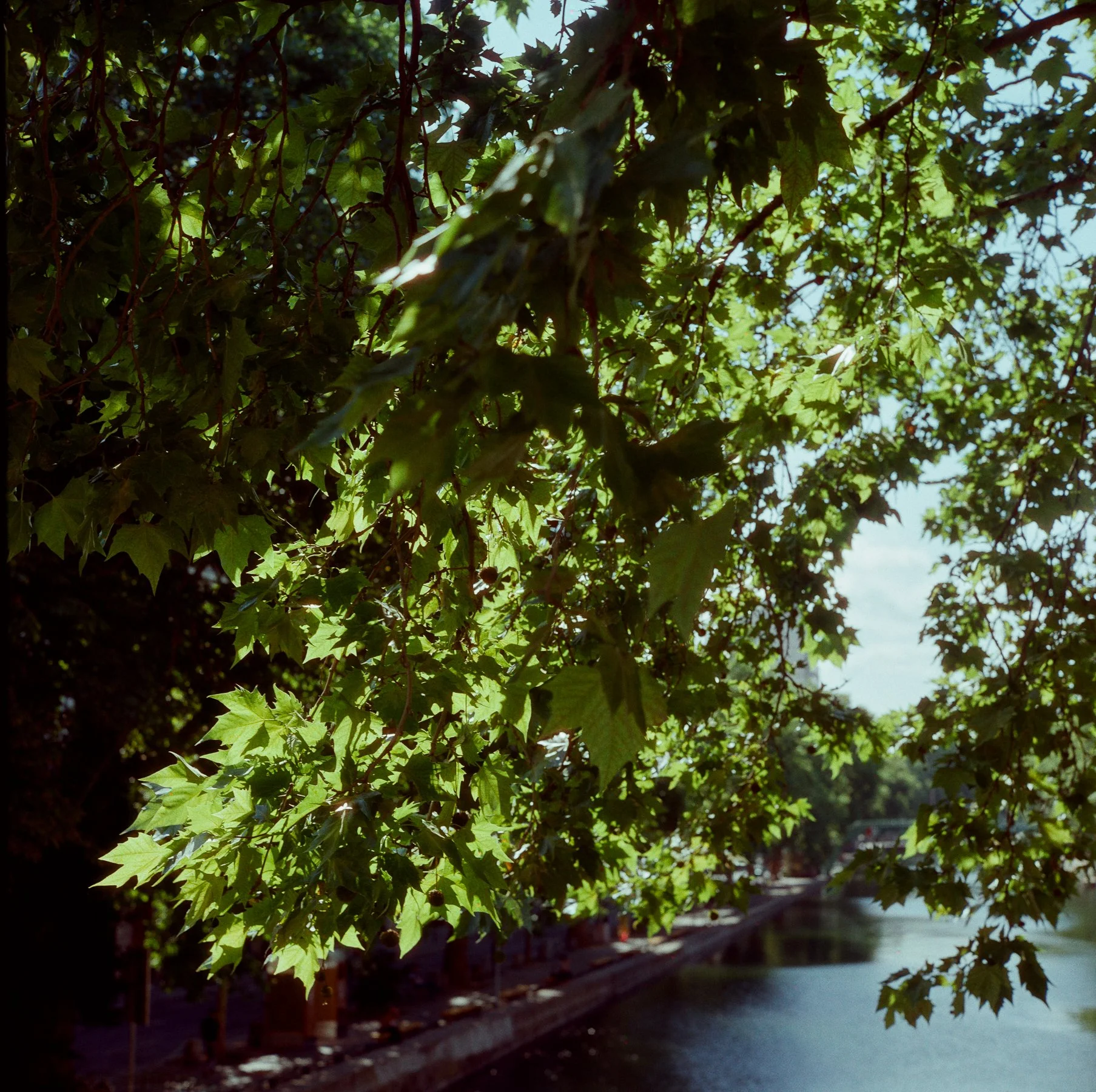
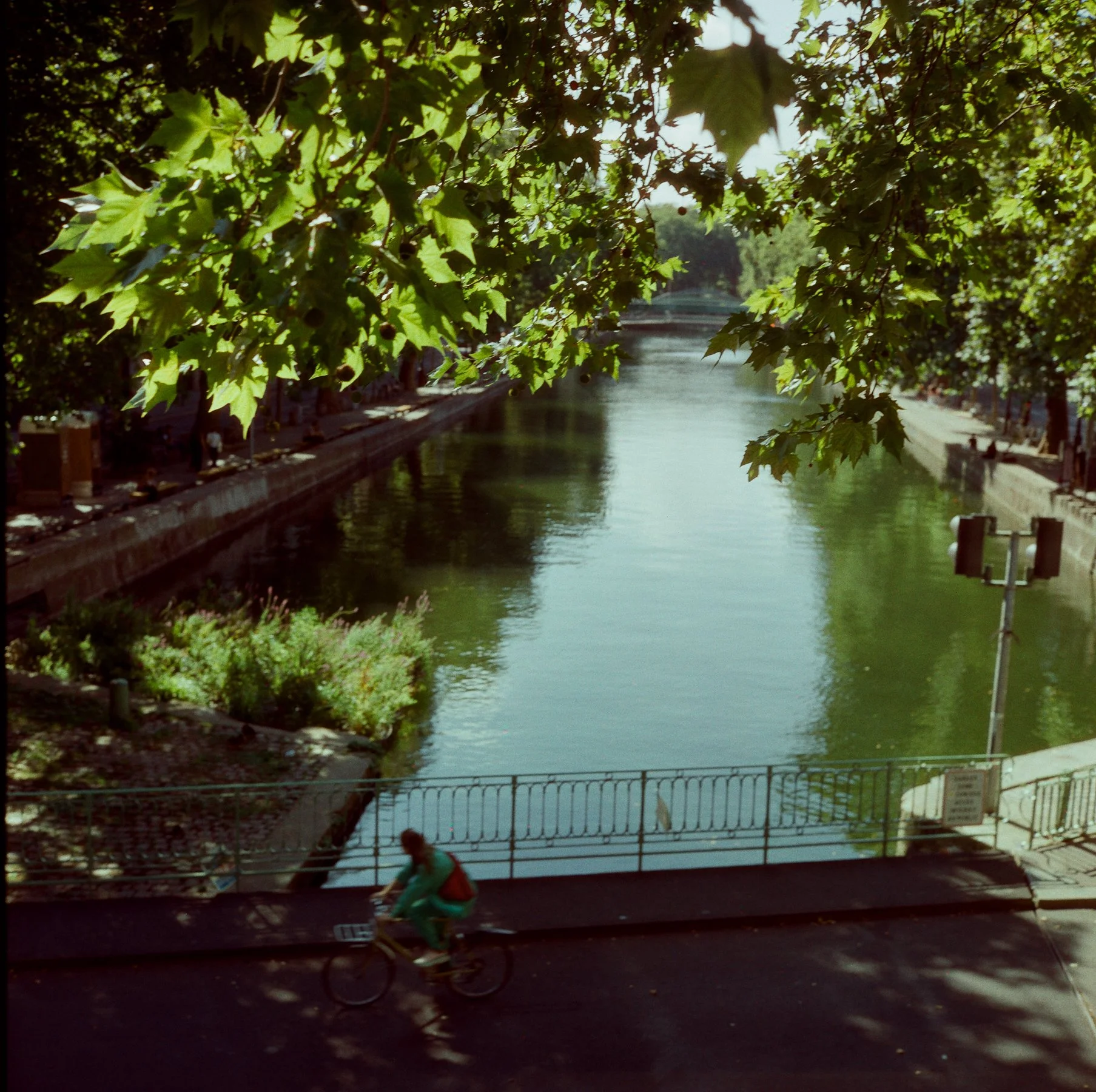
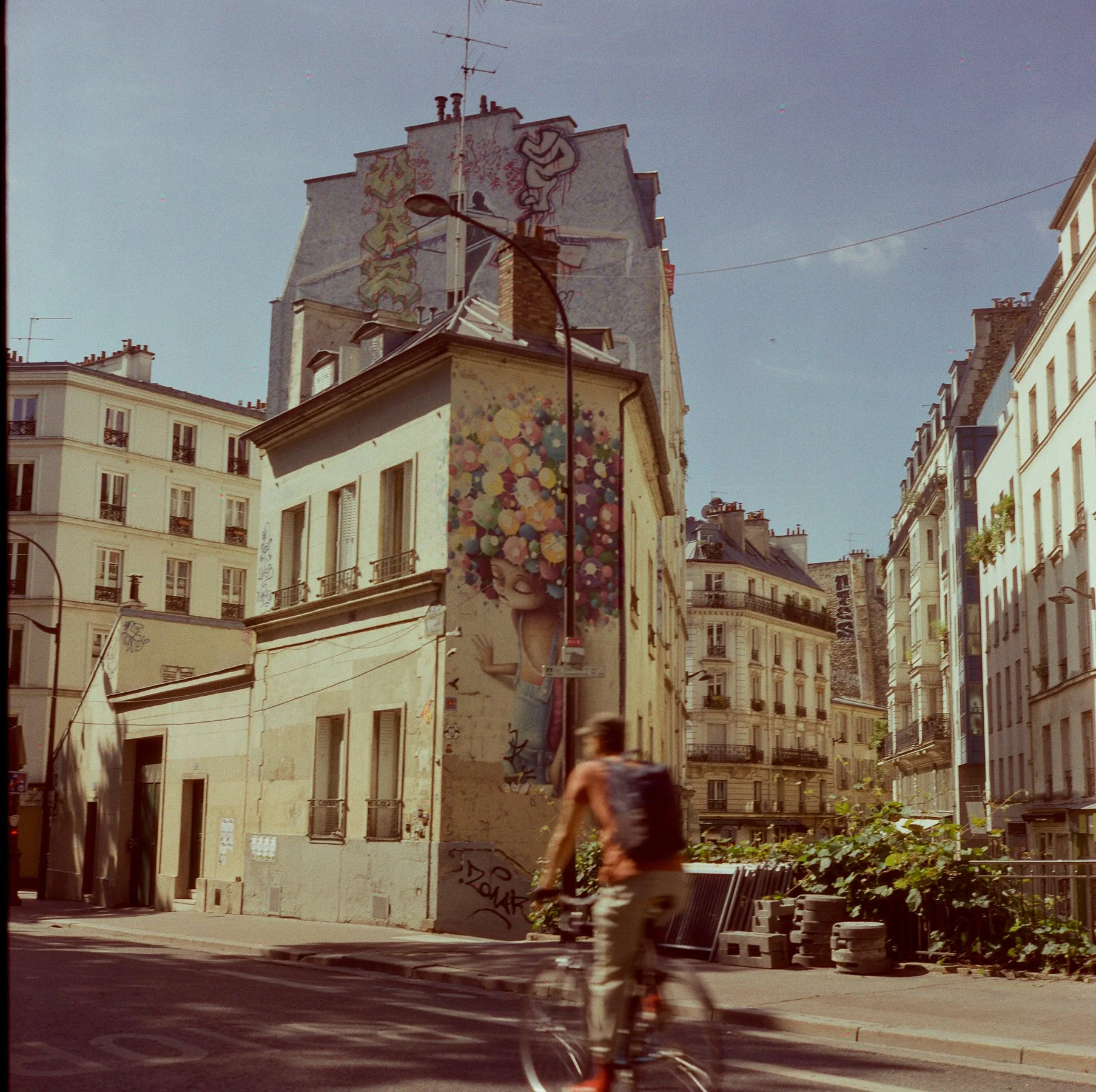
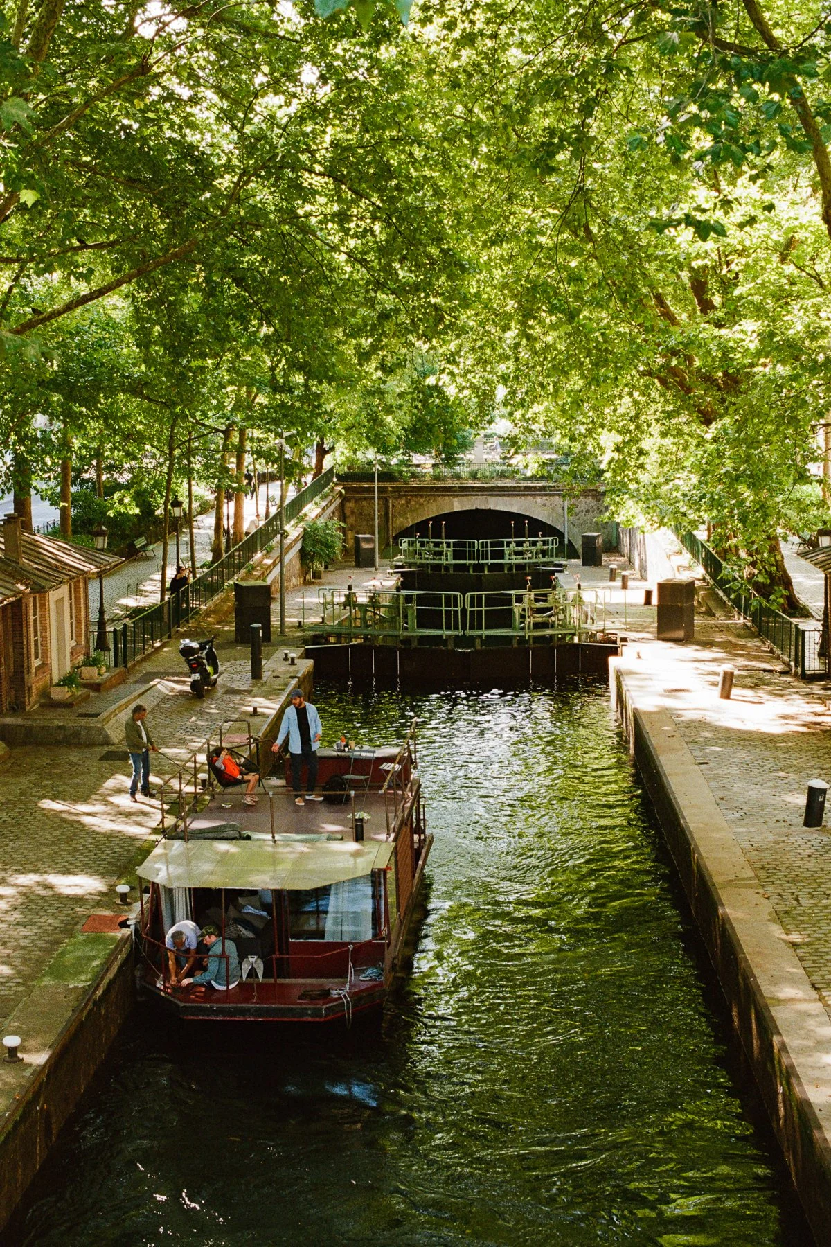
I noticed a nice punch of color with some contrast. The shadows leaned blue, and details held up well in deep shadows (see images of the bridge arches or canal lock) without getting muddy. My photos seem to have a lot of greens and blues, which rendered well, but the scans had a very purple tint, and I adjusted the tones slightly, which I don’t usually do. I think the reds came out a bit dull and leaned too orange, which was kinda disappointing given the manufacturer's claims about "great reds" and compared to what I've seen from other photographers like MetalFingers. Overall, the colors were consistent across varied lighting scenarios.
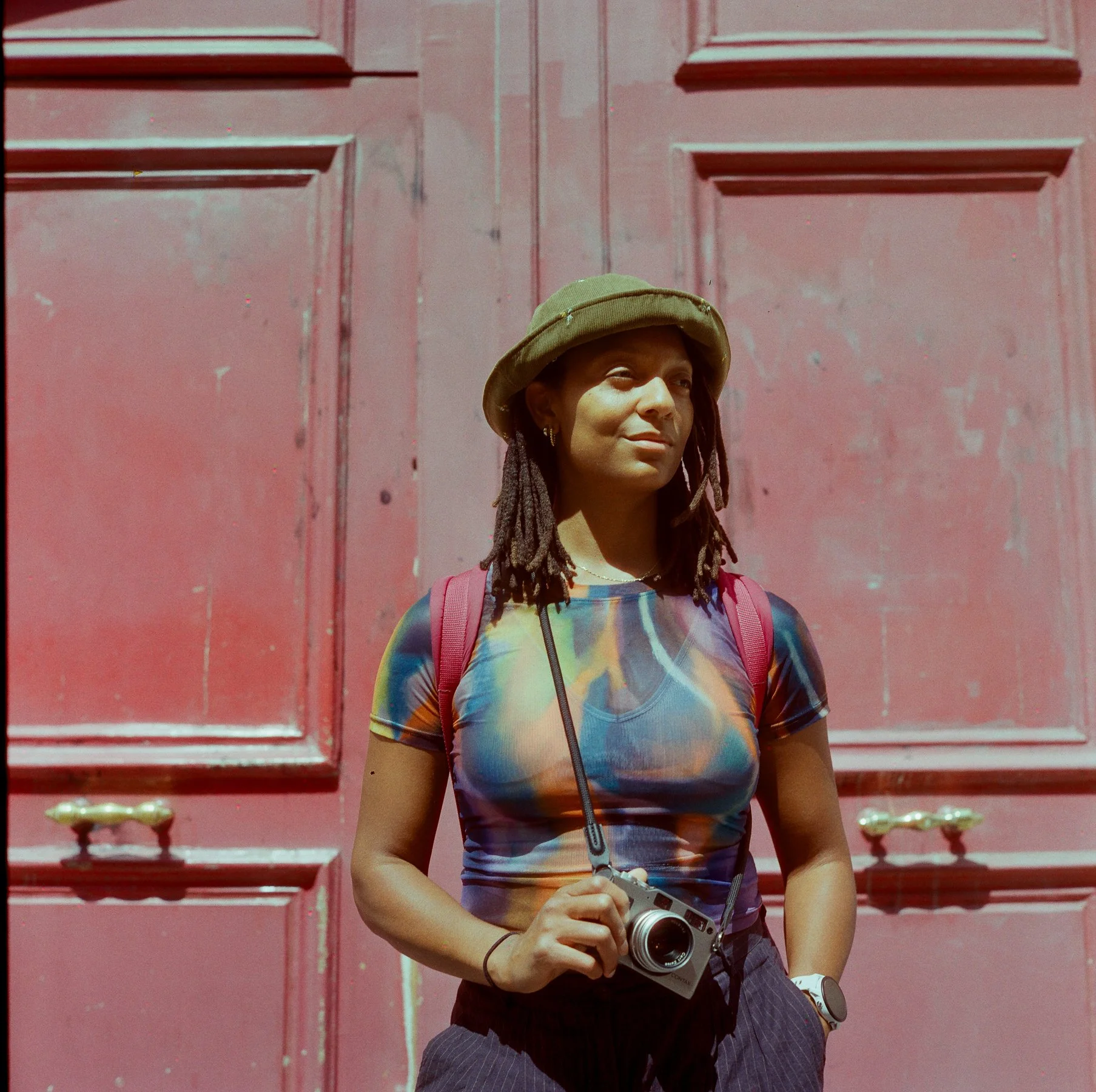
In terms of skin tones, I only took one portrait, but was kinda disappointed. I took a portrait of Saray, and I don’t think this film rendered her melanated skin very well, so hopefully that will be fixed in the final production run.
The Overall Vibe
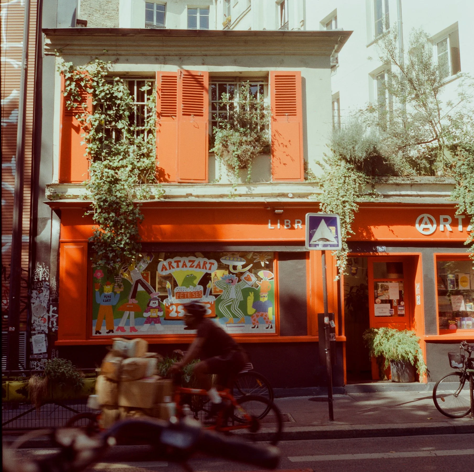
I like the nostalgic, somewhat hazy feeling of this film. It kinda gives me Lomography vibes, but there's something that sets it apart. I think it's the way it adds a warm cast to daylight scenes. See how the neutral concrete of Parisian buildings has a honeyed tone in the photo below.
The color palette is more stylized than Kodak Gold 200 but seems more neutral than Harman Phoenix (full transparency, I haven't tried Phoenix yet, it just seems a bit too intense for my taste).
Pre-Production Quirks
Based on a few other film reviews (like Kyle McDougall or Pushing Film) issues with halation, spotting and potential light leaks from fat rolls were frequently mentioned aspects to look out for in pre-production rolls. I only experienced two of the three issues, and that wasn’t enough to turn me off of this film stock.
On this roll, I did find some halation when the light is super bright, like in the water-sparkle image and the backlit leaves. This level of halation doesn't bother me and kinda adds a little dreamy character to these shots. For comparison, check out a few similar shots made with my Nikon N75 and Kodak Ultramax. There’s no halation in the bright spots behind the leaves.
Above: Compare Ultramax 400 on the left, OptiColour 200 on the right.
Also, I did indeed spot a few clusters of small red, green, and blue dots on most frames, but at first, they were hard to notice. Did you find them? They're really only visible when zooming all the way in on a high-res scan. These imperfections are expected to be resolved in the final production rolls.
A few examples of halation below…

Final Thoughts
Overall, I'd say OptiColour 200 is a solid choice for a medium-format film stock that offers vintage charm. I have two more preproduction rolls left to shoot look forward to trying more of this film when the final production rolls out in the future. Next time, I'd like to shoot this film in different light conditions, like sunrise or golden hour.
When it comes to OptiColour 200, its strength is in its personality. This is a fun, option for anyone who wants to experiment with a non-mainstream film. It's probably best suited for travel photography, street photography or portrait photography where character matters more than precision. This film isn't a choice I'd reach for on a product photography shoot or anything that requires more authentic color precision but who knows, perhaps future productions make it more stable.
At a price point comparable to Kodak Gold 200, it's definitely worth trying if you're looking for a unique Kodak alternative with vintage vibes. At the moment, you can only purchase OptiColour 200 in 120 directly from their website. The price point is good, especially given how expensive medium-format film is these days.
Thanks for reading! I offer helpful resources on travel, film, and photography. Found this useful? Pass this story along to a friend or donate a roll of film to support this type of free content.
Have you shot Opticolour 200 yet? I’d love to hear your thoughts! Feel free to share a link to your own photos in the comments below.
If you found this film review helpful, consider sharing it with another analog photographer who might enjoy it too.